sub-10 Platform
The sub-10 platform was constructed section by section, as each feature was requested, and without an overarching plan. As a result, it was clunky and unintuitive, full of duplicated information and overly complicated processes.
When I was asked to redesign some of the reporting UI, I also saw an opportunity to improve the user experience overall, re-structuring the information architecture and streamlining user flows.
My graphic design brain also jumped at the chance to introduce some of the branding elements I’d developed!
The UI that I was originally asked to address: a refresh of existing progress wheels on the platform homepage. I aimed to streamline the design, minimise visual noise, and develop a modular system which could be carried into other areas of the platform. This then allowed for a sympathetic mobile layout, including collapsing the wheels entirely, preserving vertical space.
The original site structure. Two sets of menus, and lots of duplication.
My proposed sitemap with changes to IA, menus, and access rights
One key problematic area of the existing system was the ways in which different user types accessed different information and functionality.
The system was developed with three user types in mind: essentially an admin, an invited user, and a free trial user. Despite their differing needs, all user types would see the same “profile” interface, meaning that the information shown was irrelevant for some and incomplete for others. The resultant UI was cluttered and full of extra clicks, and the menu system was needlessly layered.
After competitive benchmarking with similar systems, I recommended creating two types of profile page to channel users into two streams:
All users would have their own individual profile page, including free trial users, but admin-esque users would also be given a Company Profile page with greater access rights. This meant that the correct information was available when and where it was needed, and was otherwise hidden. This greatly streamlined both the flow and the interface for each user type.
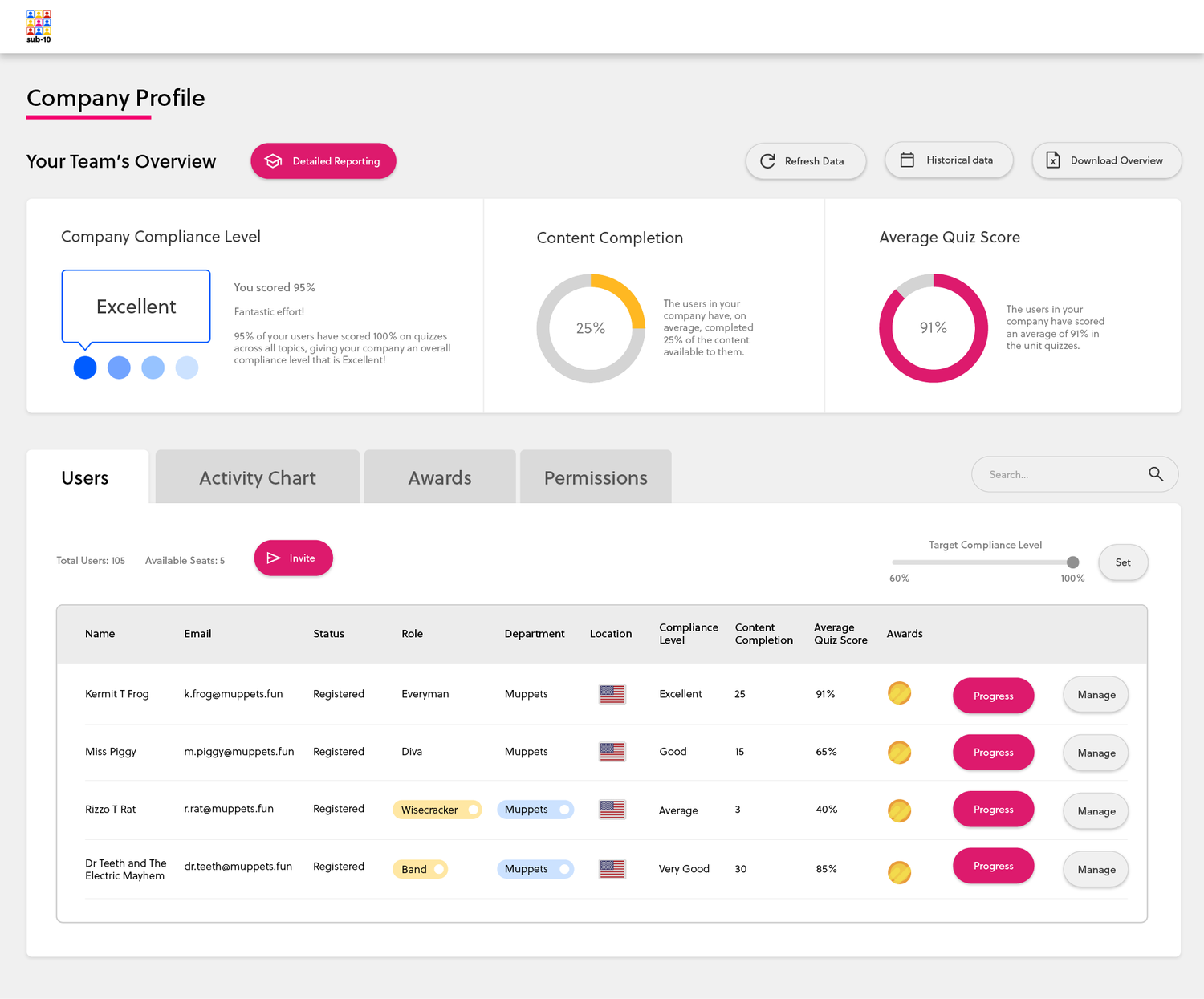
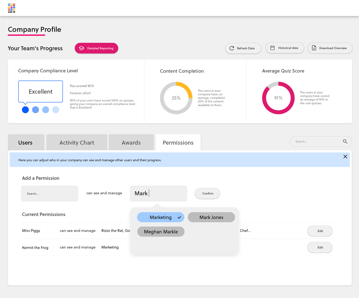
Above: My prototype of the new company profile page, with greater reporting functionality and access to permissions. The modular system served us very well here, as more types of information could be added in and around existing modules. I introduced tabs to keep the page from becoming over-long and to separate out different available functions.
The new user profile page, with the ability to add a profile image and view and edit your details. Also shown is the improved usage graph, with only 2 data points and clear comparison between them .
Another issue stemming from showing all user types the same UI was the complexity of the menu system, which hid basic functionality — such as viewing your own user details — two layers down.
Once we had decided to separate user types and different access rights, I recommended combining and streamlining the menu, and surfacing some common user-specific tasks on each type of profile page. This would give far more immediate control and freedom, and remove an entire menu layer.
The line graph of usage displayed on all profile pages originally had 4 data points. It was implemented to allow admin users to draw quick conclusions about the effectiveness of the system… but the competing colours and closely-related lines actually served to hide the data.
After speaking with stakeholders to gauge which information was most useful to see front and centre, I recommended reducing the graph to 2 data points and switching to a mixed graph to show more clearly how they intersected. Swift conclusions can now be drawn about usage and success over time, allowing managers to make interventions when needed.
The platform contains a lot of industry-specific functionality which many users will be familiar with. It also contains a lot of processes unique to our system that users might need help with. Despite this, internal stakeholders were adamant that an onboarding system was not needed, and would in fact be annoying for users.
Through competitive benchmarking, demonstrations of user flows, and presentations of basic prototypes, I convinced the team that a few well-placed onboarding cards would immediately speed up the process of getting our customers set up, as well as allowing us to communicate our brand personality. We were also able to expand our Help & Support documentation using the step-by-step guidance they provided, and so their value was quickly recognised.