sub-10 Landing Site
The sub-10 landing site is one of the first impressions potential customers get of the company, the product, and the people… and in 2022 it had a bounce rate of 70%.
I was asked to improve the UI, but again, saw an opportunity to refine the user experience overall. I ended up completely redesigning the site, from the ground up. Stakeholders were keen to see the branding used in the events brochure carried through into the visual design of the site, so many of the stylistic elements are the same.
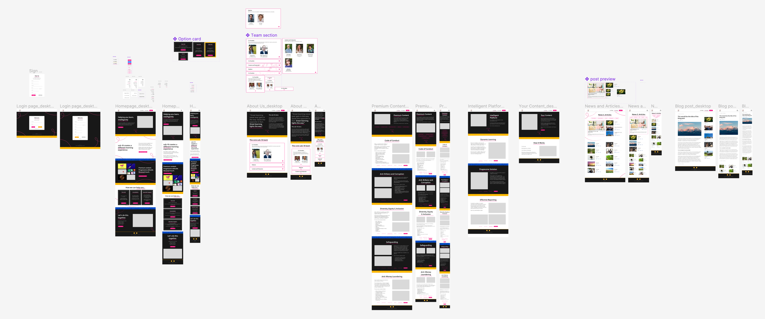
A screenshot of the Figma project, showing designs for a number of static pages, a blog and blog post layout, and specific designs for tablet and mobile layouts.
The original site was created using Wordpress when the company had a slightly different product and was aiming for a different audience. As the messaging changed, new copy had been added, but the existing structure remained. This resulted in a confusing site with a confusing message.
I spoke with stakeholders and users, and conducted a UX review which highlighted areas of duplication, mismatched messaging, and user pain points.
My main recommendations were around the information architecture of the site, bringing the most important information onto the front page, and moving greater detail out of the way until needed.
The About Us area had previously been 3 separate pages: one to recount the story of the company, another to introduce the employees, and a third which replicated some of both of these pages and existed only because the Wordpress template was set up to make the menu item a page. In addition, each employee had 150 words of introductory text.
I recommended changing the menu functionality to remove the unnecessary content, and combining the two remaining pages into one much-abbreviated area. I also suggested grouping employees by department, shrinking introductory text down to a department-specific sentence, and using collapsible trays to show and hide information as needed.
The new homepage, with layout adjustments for tablet and mobile breakpoints.
The new and improved About Us page. The collapsible trays allow the user to find who they’re looking for more quickly, and will also allow the company to add more employees neatly as they grow.
We made the decision to build the new landing site in-house using our own CMS, but much of the functionality needed was pretty similar to Wordpress: relatively static pages, with the ability to add or change images and text, create new pages, and add blog posts. To that end, I worked to design a modular system of page types, allowing all content on the site to be structured in a similar way, but with flexibility depending on message and media.
The final improvement I made to the landing site was a flexible sign up/login page, smoothly transitioning users into the platform with a consistent brand image.
I did the majority of the UX writing for the platform, and enjoyed this opportunity to extend our friendly-yet-professional company personality a bit further. Since everything had originally been quite impersonal, the introduction of some more conversational instructional text was a marked — but welcome — change.
The site as I designed it is no longer live. The company rebranded in early 2023, and moved in a different direction. However, in the period when my design was live, the issues I identified and the changes I suggested reduced the bounce rate to ~25% — a resounding success.